Whoa, blog #2. Who knew I’d be going this far with actually being productive on my own website? Thanks, I appreciate your vote of confidence in my abilities. 😉 Today is an important day because I want to enlighten my audience (or at least my own subconscious) on the definition or difference between good website design vs. bad. Now before we begin, please keep in mind this is my opinion mixed in with actual tips to help your site rank better, I’ll leave it up to you to decipher what is what.
Mobile Responsive for LIFE!
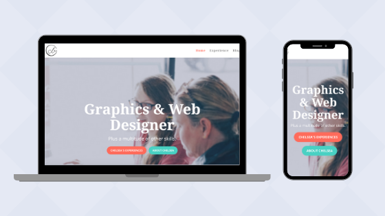
At the very top of our list for a good website design vs. bad is whether it’s mobile responsive, but what does mobile responsive mean? Basically, it means that when you look at a desktop and compare it with your smartphone, the design is visibly similar but different. Text, images, etc. on a mobile responsive site are all optimized to fit two or more different screen sizes (i.e., desktop and phone being the most prominent example).

You’re probably thinking, how do I test if my website is mobile responsive if I don’t have my phone? The easiest way to check your site is to open a browser window, go to your website, and drag the corner of your browser window inwards. If your design resizes text and images, it is most likely your site is at least what we in the web design industry call “mobile-friendly.” If you don’t see any changes, your website is probably far too old, and Google will acknowledge your age and wisdom, but it will also reduce your rankings for being too stiff to join us in this century.
So how do you fix your mobile responsive woes? Build a new site. No, I’m totally serious. At this point in your website’s life, it’s time to make like a phoenix and shoot for a rebirth instead of prolonging a long and painful online death. Your site has probably seen better days and needs a good overhaul not only with design but probably content and imagery too.
A website is meant to be flexible!
As you’re moving forward with your new website design, please keep in mind that websites are not like print. Let me say that again; WEBSITES ARE NOT LIKE PRINT. Too often I run into clients that think in the mindset of print, the text needs to wrap at a particular word or space between sections needs to be bigger or smaller. Being too precise with a website causes special issues with flexibility. Your website will need unique treatments and sizing for each size variation, which takes more time with your website developer and, in the end, more money out of your pocket. A site is truly organized chaos in a sense some things you should just let slide while others you should lightly control.
How big is too big for a website?
So you have a website, and it’s mobile responsive; however, it’s super slow, and you aren’t sure why or how to fix it. Determining what is slowing your website down is a tricky business to figure out, let alone fix if you don’t really know what you’re doing, so I’ll try to make this as simple as possible.
How big are your image files? Having large high-quality images on your site, while important, could be causing issues with your page loading speed. So how do you check and or fix the problem? The easiest way would be to add a plugin that’s purpose is to optimize your image sizes for the web. Now since there are a million and one different plugins to choose from, I won’t suggest one but here are a few tips on what to look for:
- Check the last time it was updated. Don’t pick a plugin with no history behind it unless you know the developer(s) and try to steer clear of ones that haven’t been updated in the last six months.
- Review the reviews. See what other people are saying but take it with a grain of salt because some of their competition or unhappy users may troll their reviews.
- What other features does it have? It may be possible to kill two birds with one stone by getting a plugin that does multiple things instead of just one.
- Make sure it works with your theme. Not all plugins and themes are created equal, and others just don’t get along, no matter what you do. Try finding a plugin specifically for your theme, if possible.
Do you have a million pages and posts on your site? Besides the size of your image uploads, another area that could be affecting your website could be the number of pages and posts. Ideally, your website should strive to be ten pages or less, with the exception of large institutions like government, medical, etc. that have to have a ton of H.I.P.P.A. compliant or security-related content they must follow. Having more than ten pages on your site can cause your loading speed to slow exponentially per page, and your audience will likely get hopelessly lost in your sitemap. A confused or lost audience means them spending less time on your website and more time researching your competitors. If you have 20+ pages with a minimal amount of content, you may consider combining the content from similar pages. Don’t delete the pages you’re combining right away! If you do delete those pages right away, you will likely run into broken or dead links. The best tactic to help with not losing people with dead or broken links is to 301 direct that sucker to the updated page.
High-resolution images mean you care, which in turn makes your audience care!

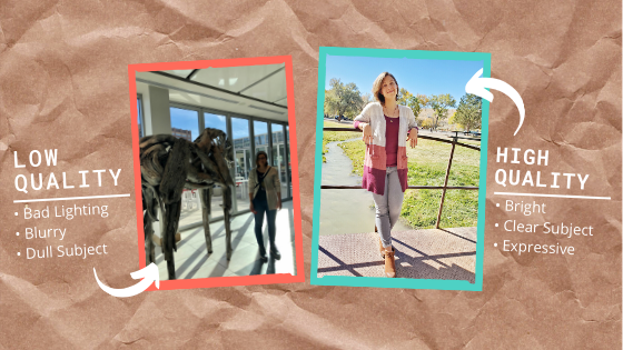
“You have to show you care about your product or services by having good photos!” I say this all the time to clients because it is 100% true. Your audience should be able to envision themselves in your photos, wearing your products, or utilizing your services. Having low-quality, blurry, and pixelated photos is a visual nightmare that gives even a blind cat a headache. Please, please, please take the time to have a professional photography session or purchase some relevant stock imagery for your website. If you don’t find your photos exciting or compelling, your audience won’t either.
Keep it simple stupid (K.I.S.S.)
Your website should be easy enough to use a cave dweller could use it without having a seizure.
Animations: With today’s technology in website development, you can easily create a website with a ton of animations, but more is not always better. Having too many moving, shifting, or bouncing pieces on your website can be visually assaulting, and to your audience, it could come off as being a little too pushy. I’m not saying you can’t have some animations; just try to keep it to a minimum so as not to overwhelm.
Colors: We may need to have another blog entirely dedicated to this topic, but for now, let’s keep this short since we’re 1,000+ words deep in this already. Colors should be picked with a purpose. Bright or vibrant colors, while eye-catching, can be hard to read text on or cause what’s called “visual vibration.” Bold or cool colors can be calming but also can translate to feeling hard and unfeeling. It’s best when picking your colors to have a mix of cool, natural colors to alternate with your primary background color plus at least one or two bright colors for call-to-action or areas you want to highlight.
Fonts: This is another big topic for any website or branding. Your font choice is your first impression with your customers. A great practice is to pick up any book(s) sitting around you; each is different; each utilizes at least one to two fonts. Without reading the title or description, what do you think the book will be about? What age group do you think the book is for? Now that you’ve judged a book by its cover, what think back to your website. What do you want your font(s) to say about you? Are you old or timeless? Bold or passive? What’s your ideal age group, and what fonts do you think they will respond to?
Now, how many fonts should you have on your website? As a designer, I would say one with at least three different weights. However, do not have more than two different fonts on your website. There are two reasons to not overdo it with fonts on your site: 1) Too many fonts is like bright colors or animations, it overwhelms the senses. 2) It can reduce your site loading speed if you have custom fonts at every interval.
I think we’ve pretty much covered the main points of good vs. bad website design. I know I’ve given you a lot to consider, but I hope you’ve found this all insightful into the world of website design.
Wishing you well in all your website design endeavors.
—Chelsea

